IELTS Graph Feedback Forum
Sorry but the forum is temporarily closed for making new posts. However, you can still read and comment on what other visitors have said below.
Here you can post your own Task 1, such as a graph, pie chart or letter, so other IELTS students can comment on it.
If you post, please make sure you attach a copy of the graph or diagram. Without this, your writing will not be posted.
Please note that I will not likely be able to comment on it - it is for other visitors to the site to comment if they would like.
What Other Visitors Have Said
Click below to see contributions from other visitors to this page...
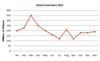
IELTS Line Graph - Dubai Gold Sales 
The line graph gives information about gold trade in Dubai from January to December of the year 2002.
It is clear in the graph that the gold sales reached …
IELTS Table - Underground Railway System
Hello,
My name is Wahyu and I want to improve my English writing skills.
Can anyone help me to correct, comment, or review my writing?
This …
IELTS Line Graph - Fast Food Consumption
The bar graph represents the weekly expenditure on three categories of fast food according to income groups in britain while the line graph illustrates …
IELTS Bar Chart - Changes in Average House Prices
The bar chart below illustrated the changes of the price in overall accommodation prices in five different cities in two time periods: 1990 to 1995, 1996 …
IELTS Bar Chart - Honey-Bee Colonies and Production
The charts gave information about the number of honey-bee colonies and the amount of honey production in the United States between 1970 and 2010.
The …
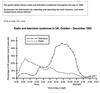
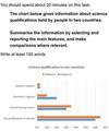
IELTS Line Graph - Radio and Television Audiences
This line graph shows the percentage of audiences in UK who entertain TV and radio through the day from October – December in 1992.
Generally, the …
IELTS Bar Chart - Global Population Percentages and Distribution of Wealth
Hi! This is the first practice test I've taken in preparation for the IELTS. I would like to be critiqued on this summary I have written of the chart posted …
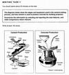
Diagram task 1 - Cement-making process
These diagrams illustrate the process of making cement first, followed by a visual explanation of concrete’s production. While cement is made through a …
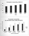
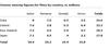
IELTS Bar Chart - Computer Ownership
Hi, may i please have a feedback on my ielts writing below? any suggestion is a huge help. thank you.
Computer ownership increases significantly from …
Task 1: Cinema Viewing Figures For Films
Can someone check this....Please give me my possible band score...tnx
The table chart elucidates information on the cinema viewers for films by the …
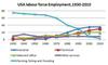
IELTS Line Graph - Employment Patterns in the USA
Hello everyone!
I have to say that: this has been the first time i try writing an IELTS writing task 1. I am sure that I have made a lot of mistake. …
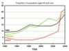
IELTS Line Graph - Proportion of Population Over 65 
Hello everyone, please check out my essay. Friends check the coherence and cohesion, structure of the essay. Thanks a lot.
***
The bar chart shows …
IELTS Bar Chart - Science Qualifications
The bar chart illustrates the percentage of science qualifications in Malaysia and Singapore. On the x-axis there are 4 types of qualifications in science, …
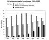
IELTS Bar Chart - UK Telephone Calls
The bar chart depicts the total no. Of million minutes utilized for different phone call types categorised as local, national & international and mobile …
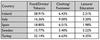
IELTS Table - Consumer Spending on Different Items
Hi,
I really need a band 7. Can you please tell me if its good enough for me to sit the exam. I will really appreciate your answer :)
***
…
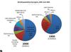
IELTS Pie Chart - Global Population Change
Can anyone check my graph essay?
The pie charts compare the change of global population between 1990 and 2000.
It is clear that there was a significant …

IELTS Bar and Pie Chart - Reasons for Study and Costs
The charts illustrate the results of a survey of adult education.
As it can be seen from the table below, the main reason for adult education is interest …

IELTS Bar Chart - Percentage of Urban Populations
Hi,
I have been studying for the IELTS for over a year now, and my reading and listening is acceptable (estimated to be 8.0+), but my writing has …

IELTS Table - Computer and Internet Users Not rated yet
I am pleased to connect with you, we'll help each other improve our Ielts skills. This is my recent task needed your comments.
***

The table …
IELTS Bar Chart - Software Downloads Not rated yet
Can you guys please help me to find something wrong with them? I have written this graph twice and also within 15 mins.
Description One
The …
IELTS Bar Chart - Annual GDP Growth Not rated yet
The bar graph shows how levels of annual GDP growth for Tunisia, Ecuador and Japan have altered from 2007 to 2010.
More specifically, in 2007, Tunisia’s …
IELTS Bar Chart - Number of Car Journeys to the City Centre Not rated yet
The chart elucidates the number of journeys with car into the city center by residents and non-residents over ten years period. The x-axis shows the years …
IELTS Line Graph - Number of Visits to Two New Music Sites Not rated yet
The line graph shows the amount of visits received by two music websites, Music Choice and Pop Parade, in a period of 15 days.
Overall, it is clear that …
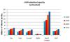
IELTS Bar Chart - Oil Production Capacity Not rated yet
The bar chart illustrates the capacity of oil production in millions of barrels per day for 6 Gulf nations over a 20-year-period.
It can be seen that …
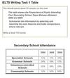
IELTS Table - Secondary School Attendance Not rated yet
The table indicates the percentage of students who attended four different secondary schools in the years of 2000, 2005 and 2009.
As seen in the table, …
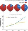
IELTS Pie and Line Graph - Spending on Restaurant Meals Not rated yet
hello guys,
could you help me to grade my IELTS task 1 writing?
I appreciate your help.
The pie charts illustrated food budget ratio between dining …
IELTS Table - Pupils who entered higher education Not rated yet
Hi! Could you help me to improve my writing skills?
The table below shows the percentage of pupils who entered higher education from five secondary …
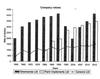
IELTS Bar and Line Graph - Three companies selling farming equipment Not rated yet
Hi! Could anyone grade my graph?
The graph shows the value in thousands of dollars of three companies selling farming equipment every five years …
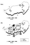
IELTS Map - Tourist Facilities Not rated yet
can someone please check my task 1 and rate it.
The two maps show the same island. The first one is before and the second one is after the construction …
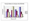
IELTS Bar Chart - Transport used to travel in a European City Not rated yet
The bar chart illustrates the different types of transports used to travel in a European City from 1960 to 2000. It is evident from the chart that, car …
Line Graph - Average weekly earnings of graduates and non-graduates Not rated yet
please check bellow task
The graphs provide the comparison of weekly income in average, for both genders, who have academic degree and non-academic …
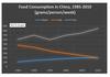
IELTS Line Graph - Food Consumption in China Not rated yet
can i get a band 8 for my graph?
The line graph compares the amount of food eaten by Chinese consumers from 1985 to 2010.
Overall, it can be seen …
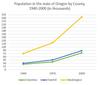
IELTS Line Graph - Population in the US State of Oregon Not rated yet
It'd be nice of you if you help me and correct my mistakes to avoid making any in my IELTS exam. thank you so much.
The line graph compares the change …
IELTS Line Graph - The changing patterns of domestic access to technology Not rated yet
The graph illustrates the changes in domestic access to modern technology in the UK from 1996 and 7 years later.
It is apparent from the charts, domestic …
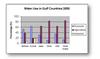
IELTS Task 1 - Use of Water among Gulf Countries Not rated yet
The graph compares domestic, agriculture and industrial use of water among gulf countries, in the year of 2000. It can be seen that Oman and Saudi Arabic …
New! Comments
Any questions or comments about this page or about IELTS?Post your comment here.