IELTS Pie Chart - Global Population Change
by chair mao
(beijing)

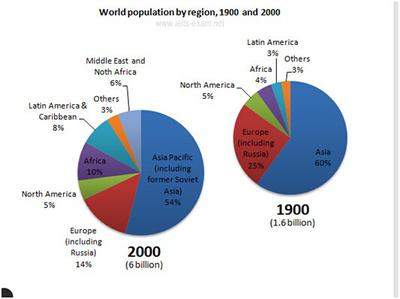
The pie charts below give information about world population in 1900 and 2000.
Can anyone check my graph essay?
The pie charts compare the change of global population between 1990 and 2000.
It is clear that there was a significant rise in the total number of world population, from 1.6 billion to 6 billion over a century.
In 1990, Asia accounted for 60% of the world population. Although this number dropped by 6% in 2000, Asia still represented the largest population of the world. European also experienced a fall in its population, from 25% in 1900 to only 14% in 2000; by contrast, the population in both Africa and Latin America increased more than twofold over the 10 decades, with the numbers climbing to 10% and 8% respectively in 2000.
However, in 2000, a new group named Middle East and North Africa was shown up, representing 6% of the global population. Interestingly, the figures for North America and others remained unchanged over the 100-year period, totaling less than 10% in 2000.
Comments for IELTS Pie Chart - Global Population Change
|
||
|
||
|
||
|
||