IELTS Line Graph - UK Fast Food Consumption
by uzma abbas
(lahore)
, in the UK from 1970 to 1990.")
The graph gives information about the consumption of fast food (in grams per week), in the UK from 1970 to 1990.
The bar graph represents the weekly expenditure on three categories of fast food according to income groups in britain while the line graph illustrates the total consumption of these fast foods in the time period of 20 years between 1970-1990.
Overall, it can be seen that hamburger is the favorite fast food between high and average income groups and that its consumption has gotten a sharp rise over the time span of 20 years.
At first, the bar graph shows the expenditure comparison among hamburgers, fish & chips and pizza. Hamburger is the highly consumed food in high and average income groups where it costs 40 and 32 pence per week respectively. Contrary, in low income group, more money is spent on fish and chips around 17% which corresponds to the money spent on them in high income group. Pizza expenditure has a gradual falling trend from high to low income groups which is 20%, 12% and 6% respectively.
On the other hand, the line graph depicts that fish and chips were the highly consumed fast food in 1970, consumption 300 gms but with the passage of time, its consumption showed a gradual descending trend till 1990 when it reached around 200gms. While hamburger and pizza showed increasing trend, in which hamburger showed an abrupt rise and reached at 500 gms till 1990. Pizza consumption took a steep rise and could just reach at 220 gms which is the same as the most lowest level of fish and chips consumption.
Please give comments below on your thoughts about this graph.
You may be able to help the student improve their IELTS score.
Comments for IELTS Line Graph - UK Fast Food Consumption
|
||
|
||
|
||
|
||
IELTS Line Graph - Australian Fast Food Consumption
by Ala
(Oxford United Kingdom )
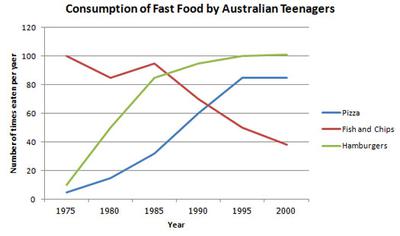
The graph illustrates, the changes in Consumption of fast food by the Australian Teenagers, including three types of food, Pizza, Fish and chips and Hamburgers, between 1975 and 200 . A period time of 25 year.
In 1975, there was an increase in each of Pizza and Hamburgers except the Fish and Chips went down. In 1980, It's still the same as before, for the Pizza and Hamburgers expect Fish and Chips still dropped down slowly as which shows in the graph. From 1985 to 1990 the Fish and Chips decline for about 30 per-cent and Pizza and Hamburgers still rise From 20 per-cent to 40 per-cent for Pizza and 57 per-cent for Hamburgers which demonstrates in the graph below. From 1995 to 2000 as we see the Pizza and Hamburgers still steady remains as the same number of times eaten per year. I think if the people didn't make any solution for this problem may Fish and Chips well not go make again.
Comments for IELTS Line Graph - Australian Fast Food Consumption
|
||
|
||
IELTS Pie and Line Graph - Spending on Food and Restaurants
by Alikung

The charts show the percentages of their food budget the average family spent on restaurant meals in different years. The graph shows the number of meals eaten in fast food restaurant and sit-down restaurant.
The pie charts describe the budget percentages of average family for their foods in restaurant and home cooking meals between 1970-2000 periods. Furthermore, there is a line graph that indicates the number of meals per year were eaten by people in fast food restaurant compared by sit-down restaurant in the same periods.
In the beginning of this period, the family cost domination was spent for home cooking meals (10%), although, the different condition occurred in 2000, while the food restaurant allocation reached the peak and dominate the budget, for about one out two parts. Through this term, the consumption of restaurant foods continued to rose steadily about 5-15% for each next years. In 1970, amount of meals were eaten in fast food as much as sit-down lounge (20), otherwise in the end of this term, fast food reached the peak and lead the markets with sharp increases along the years. Sit-down restaurant foods have same trended as fast food, however, the rising less than that.
Please give your comment, thank you.
Comments for IELTS Pie and Line Graph - Spending on Food and Restaurants
|
||
|
||
|
||
|
||
IELTS Line Graph - Fast Food Consumption
by kuttiana84
(scottland)

The line graph shows changes in the amount and type of fast food consumed by Australian teenagers from 1975 to 2000.
The line graph depicts variations in the fast food consumed by Australian teenagers between 1975 and 2000. Unit is given in number of times eaten per year.
Overall, it can be seen that intake of hamburgers and pizza has increased while that of fish and chips has fallen down during the period.
To begin, the consumption of hamburgers and pizza stood at around 10 in 1975. Over the next 20 years, there was a gradual rise in their uptake with hike in the former was much more than the latter reaching to approximately 100 and 85 respectively in 1995. Thereafter, the figures remained steady till the end of the period.
In contrast, the utilization rate of fish and chips which was 100 in 1975, fluctuated in the next two years and thereafter showed a dramatic decrease to reach the trough of around 40 in 2000, which was the lowest among all the three during that period.
Help this student to improve their score by proving feedback below on this IELTS Line Graph about Fast Food Consumption.
Comments for IELTS Line Graph - Fast Food Consumption
|
||
|
||