IELTS Line Graph - Proportion of Elderly
by Sarvar

The graph shows the proportion of the population aged 65 and over between 1940 and 2040 in three different countries.
Hello everyone, please check out my essay. Friends check the coherence and cohesion, structure of the essay. Thanks a lot.
The bar chart shows some information on the population aged 65 and over in the UK. The data are available for 1985 and there is a projection for 2035.
As an overall trend, the proportion of people aged 65 and over will be by far higher in 2035 than in 1985. In 1985 the aging population has the largest percent of just over 15% in Wales. While the share of Northern Ireland is less by about fifth and is around 12% which is the smallest for the same year. By the year 2035, Wales will have the largest share in the aging population again, and it will exceed its own figure for the year 1985 by about two-thirds coming up to over 25%.
It is interesting to note that England and Northern Ireland will have the same shares of about 23% in 2035 whereas back in 1985 their portions significantly are not the same.
Comments for IELTS Line Graph - Proportion of Elderly
|
||
|
||
|
||
|
||
|
||
Proportion of population aged 65 and over
by najla
(Saudi Arabia )

The graph below shows the proportion of the population aged 65 and over between 1940 and 2040 in three different countries.
Hi, Can you correct my writing plz?
The line graph demonstrates the proportion of the population aged 65 and over between 1940 and 2040 in three different countries as in indicated on the x-axis.The y-axis indicated the percent proportion of elderly people .According to the legend proportion of population aged 65 and over is described by the solid line in the three different countries.
In 1940,the percent of USA was under 10% whereas the percent of the elderly in Japan was lowest at 4%, whilst Sweden was in the middle of theme .
The percent of the elderly in these the three countries will changes through 30 years. The percent of the elderly in Japan will rapid at 27%as also USA will 25% respectively whereas Sweden will be under at 23% .
Clearly , the line graph expects that the percent of the elderly in these the three countries will change significantly over 25 years.
Comments for Proportion of population aged 65 and over
|
||
|
||
IELTS Line Graph - proportion of population aged 65 years or above
by fazal rehman
(karachi,Pakistan)
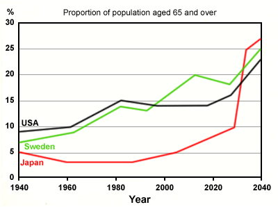
The graph illustrates the proportion of population aged 65 years or above, between 1940 and 2040 in Japan, Sweden and USA, a period of 100 years. Overall the proportion of aged 65 years or above in Japan increased highly as compared to other two countries. While USA and Sweden move upward,however Japan could not overtook Japan.
Initially, in 1940 the proportion of aged 65 years or above in USA was high among other countries. In a graph it can be seen the proportion increase slightly till 1960 and after sharply increased to 15 % in timescale of 1960 and 1980 and decline gradually then sharply inclined after 2019.
Japan has low number of proportion among two counties.After 1940 it gradually declined and reached to the lowest point in approximately 1982. It slowly inclined till about 2023. sharply shoot up ust after 2023 and reached to the highest point about 28% in 100 year of timescale.
Sweden had about 7% proportion in 1940. it level off 13 % in 40 years.The biggest rise has been between 1995 to 2005.
Comments for IELTS Line Graph - proportion of population aged 65 years or above
|
||
|
||
|
||
IELTS Line Graph - Elderly People
by dad
(ph)
The line graph illustrates the percentage of elderly population aged 65 and above in three different countries between 1940 and 2040, a period of 10 years. Overall, it can be seen that the percentage of old citizens in the Japan country declined over the year period, whereas in the Sweden and USA population increased and shows similar pattern throughout the year.
In 1940, the proportion of aged population in Japan was the least compare to the other two countries, with an average of five percent, it then shows a period of stability between 1960’s and 1980’s. It can be seen that the proportion of aged citizen gradually increase throughout 2000 and 2020, with a sharply increase in the middle of year 2020 and 2040, with an average of 25%, until it overtook the level of aged population in Sweden and USA and finished just over 25% in 2040.
In sharp contrast to this, the proportion of aged population in Sweden and USA shows similar pattern throughout the year. The aged population in Sweden increased gradually from 1940’s and 1980’s,with average between seven percent and just under 15%, exceeding the number of aged population in the USA before the year 2000 and finished just under 25%. Similar pattern can be seen in USA, increasing gradually from 1960 and 1980, with a plateau from before year 2000 to 2020, it finished just under the 23% in 2040.
Comments for IELTS Line Graph - Elderly People
|
||
|
||
|
||