IELTS Bar Chart - Transport used to travel in a European City
by Kazi Afzal Hossain

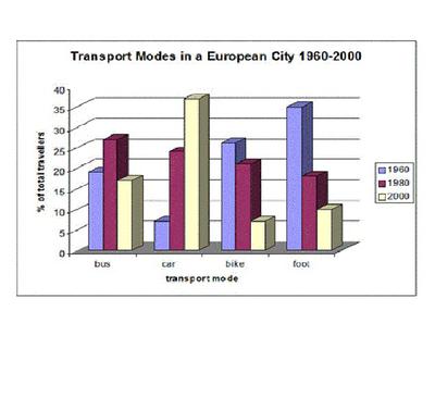
The bar chart shows the different modes of transport used to travel to and from work in one European city in 1960, 1980 and 2000.
The bar chart illustrates the different types of transports used to travel in a European City from 1960 to 2000. It is evident from the chart that, car transport was gradually increasing throughout the period, while the other transports were declined.
To begin, car traveler stood at just 5 per cent in 1960, which was 5 times less than for the bike traveler, and this was far less than on foot. Apart from a jump to approximately 35% of total travelers in 2000.
The next two transports popularity were the similar trend, both were gradually decreasing over the time frame. In 1980, bike and foot travelers were 20% and at about 18% respectively. At the end of the period, both transports were in between 5 to 8% in 2000.
Bus popularity spiked to 25 per cent in 1980. Then its popularity decreased the following year, and the bus traveler was 15 per cent.
Please give me feedback on my graph
Return to IELTS Graph Feedback Forum.