IELTS Bar Chart - Software Downloads
by Seilas
(LONDON)

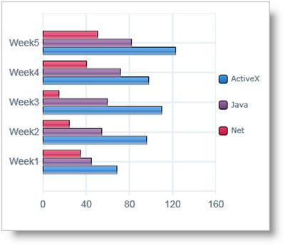
The bar chart shows the number of times per week (in 1000s), over five weeks, that three computer packages were downloaded from the internet
Can you guys please help me to find something wrong with them? I have written this graph twice and also within 15 mins.
Description One
The bar illustrates the amount of the used frequency weekly (in 1000s), in the period of 5 weeks, that three kinds of computer software were downloaded from the Internet.
Firstly, as seen from the chart, it was obvious to notice that the Active X was the most popular packages among them whenever it was downloaded in this period, which from nearly 70 to around 120 per week.
Secondly, the trend of Java in this period was increasing during this 5 weeks, from nearly 50 in week 1 to slightly over 80 in week 5.
Thirdly, the volume of Net in this 5 weeks was changed as a U-shape from nearly under 40 in week 1 to around 50 in week 5.
Totally, the number of downloaded times had grown up from week 1 to week 5 which both Active x and Jave involved in this trend.
Description Two
The bar chart illustrates the amount of downloaded frequency per week (in 1000s), during this 5 weeks, that three kinds of computer packages were downloaded from the Internet. As seen from the bar chart clearly, over this 5 weeks, the most popular package was Active X, followed by the Java and the least one that was the Net.
Overall, both Active X and Java's patterns of downloaded rate were increasing from week 1 to week 5 but there was a slightly decline of Active X in week 4 , from nearly 120,000s in week 3 to around 100,000s in week 4. Apart from Active X, the total amount of downloaded Java was lower than the Active X during this time frame, from around 50,000s in week 1 to marginally over 80,000 in week 5.
To compare with the different pattern with the Active X and the Java, the pattern of Net was changed as a U-shape from under 40,000s in week 1 to around 60,000s in week 5.
Return to IELTS Graph Feedback Forum.
Bar Chart Computer Package Downloads

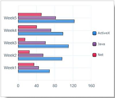
The bar chart shows the number of times per week (in 1000s), over five weeks, that three computer packages were downloaded from the internet.
I wonder if someone could try to grade my take on the first writing task on this page: Without knowing any particularities of the IELTS, I wrote the following:
This bar chart shows the number of times per week, over five weeks, that three compuper packages were downloaded from the Internet. Specifically, it compares ActiveX, Java, and Net.
As the weeks progress, more packages are downloaded per week in total. In all of the five weeks, Net is downloaded the least, while ActiveX is downloaded the most.
Java sees a steady increase, starting at just over 40.000 in week one, and reaching just beyond 80.000 in week five. ActiveX generally follows the same trend - though it starts far ahead, at perhaps 70.000, and ends up reaching even past 120.000 - but ActiveX knows a slight decrease in week four.
Net, on the other hand, starts decreasing right after week one, dropping from almost 40.000 to approximately 20.000. Only after week three, this decrease is reversed, but with just a bit more than 40.000 in week five, Net remains well behind the other two packages.
Return to IELTS Graph Feedback Forum.