IELTS - Example of a bar chart
Here you can view an example of a bar chart for the IELTS test.
This bar chart shows the levels of spending of a family on three household items - gas, food and clothing.
You should note first of all that the bar chart is over time which means you need to use the language of change.
You should also make sure that you are comparing and contrasting the items too.
Take a look at the graph and model answer, then view the comments below on the response in order to see how you can improve your answers.
Example of a bar chart
You should spend about 20 minutes on this task.
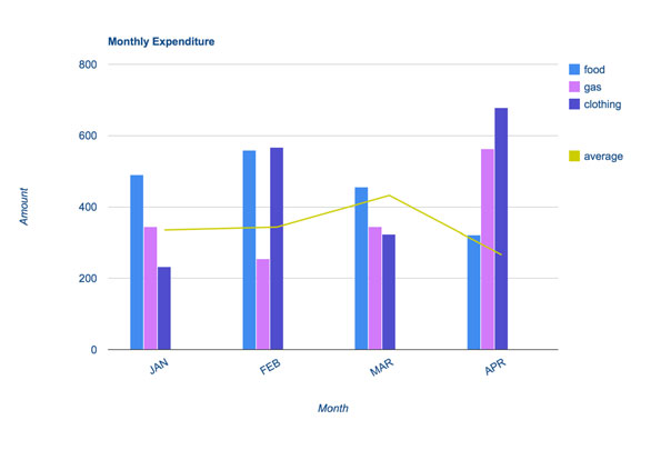
The bar chart shows the monthly spending in dollars of a family in the USA on three items in 2010.
Summarize the information by selecting and reporting the main features and make comparisons where relevant.
Write at least 150 words.
Model Answer
The bar chart depicts the monthly expenditure on food, gas and clothing of a family living in the USA in 2010. Overall, it can be seen that levels of expenditure fluctuated over the period.
To begin, in January the most money was spent on food, at approximately $500 per month. Although expenditure on food increased slightly the following month, it then fell to account for the lowest expenditure of all the items at the end of the period at just over $300.
Gas appeared to follow the opposite pattern to food spending. It started lower at about $350 per month, falling in the following month, and then increasing significantly to finish at just under $600 in April.
Clothing, which at just over $200 accounted for the lowest expenditure at the beginning of the period, fluctuated dramatically over the time frame. After reaching around the same levels as food in February (nearly $600), it dropped markedly in March, then jumped to just under $700 in the final month.
With the exception of an increase in March, average spending decreased slightly over the four months.
(183 words)
Comments
This example of a bar chart satisfies the requirements of the task.
The first paragraph introduces the graph (without copying from the rubric) and then identifies the main trends.
It is clearly organized, with each item clearly explained in each paragraph.
Importantly however, even though each item is described in turn, the description does not just describe each item in isolation. You will notice that comparisons are made between the items throughout the description.
For example:
...it then fell to account for the lowest expenditure of all the items at the end of the period...
Gas appeared to follow the opposite pattern to food spending.
Clothing, which at just over $200 accounted for the lowest expenditure at the beginning of the period,...
There is also evidence that the candidate knows how to write complex sentences:
Although expenditure on food increased...
Clothing, which at just over...
After reaching...
There is also a good mix of comparison / compare sentence structures and language of change. The correct tense is used (past simple) as the graph is referring to completed actions in the past.
Next >>>
Home › Sample Graphs › Example of a Bar Chart
Further Samples:
Model 1
Fast Food Consumption
Line Graph
Model 2
Charity Spending
Pie Chart
Model 3
School Attendance
Table
Model 4
Shopping Mall
Map
Model 5
Brick Manufacturing
Process
Model 6
UK GDP
Bar Chart
Model 7
Team Scores
Bar Chart
Model 8
Electicity Generation
Pie Chart
Model 9
British Emigration
Bar Chart
Model 10
UK Visits
Line & Bar
Model 11
Car Theft
Line Graph
Model 12
Arrests
Pie & Bar
Model 13
Modes of Transport
Bar Chart
Model 14
Living Expenditure
Table
Model 15
Making Chocolate
Process
Model 16
Monthly Expenditure
Bar Chart
Model 17
Tea Manufacture
Process
Model 18
Poverty
Pie & Bar
Model 19
Borrowing Books
Line & Pie
New! Comments
Any questions or comments about this page or about IELTS?Post your comment here.