IELTS Pie and Bar Chart
Here is an IELTS pie and bar chart and it is another example of two charts that need to be explained together.
The graphs represent poverty rates in the US in 2008.
When you describe two graphs together it is better to describe one first in one paragraph and the next in the following paragraph.
Avoid trying to cross reference the information - this is usually not necessary and is quite complex to do.
When you have a chart like this you will need to select the information carefully as there may be a lot of information.
You should not try and write about everything - you have to show the examiner that you can select and highlight the important points.
You can view a lesson on how to describe two charts together here.
IELTS Pie and Bar Chart
You should spend about 20 minutes on this task.
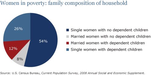
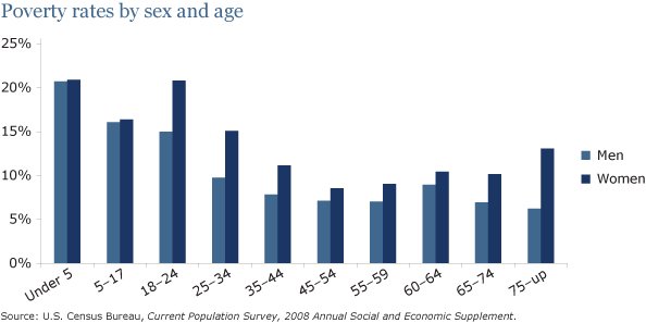
The pie chart shows the percentage of women in poverty and the bar chart shows poverty rates by sex and age. They are from the United States in 2008.
Summarize the information by selecting and reporting the main features and make comparisons where relevant.
Write at least 150 words.
Model Answer
The pie chart ilustrates the proportion of women in poverty by household composition in the United States in 2008 and the bar graph indicates the differences in rates of poverty by sex and age. At first glance it can be seen that single women with no dependent children made up the largest group in poverty and that poverty was highest for women and children.
The pie chart shows that single women suffered from poverty the most. Single women without children represented 54% of the total in poverty, and poverty for those with dependent children stood at just over a quarter. Married women with and without children accounted for the remaining fifth, or 20%.
Turning to the bar chart, poverty rates were highest amongst children, and the rates were roughly equal for males and females, at around 21% for under 5s and 15% for 5-17 year olds. However, from ages 18-24, the gap between men and women widened significantly, with approximately 14% of men in poverty compared to over 20% for women. Poverty declined throughout the adult years for both sexes, but a gap remained and this gap almost doubled in old age.
192 Words
 |
Then you may be interested in IELTS buddy's Task 1 eBook, full of tips and strategies for quickly achieving a high score in the IELTS test. |
Home › Sample Graphs › IELTS Pie and Bar Chart
Further Samples:
Model 1
Fast Food Consumption
Line Graph
Model 2
Charity Spending
Pie Chart
Model 3
School Attendance
Table
Model 4
Shopping Mall
Map
Model 5
Brick Manufacturing
Process
Model 6
UK GDP
Bar Chart
Model 7
Team Scores
Bar Chart
Model 8
Electicity Generation
Pie Chart
Model 9
British Emigration
Bar Chart
Model 10
UK Visits
Line & Bar
Model 11
Car Theft
Line Graph
Model 12
Arrests
Pie & Bar
Model 13
Modes of Transport
Bar Chart
Model 14
Living Expenditure
Table
Model 15
Making Chocolate
Process
Model 16
Monthly Expenditure
Bar Chart
Model 17
Tea Manufacture
Process
Model 18
Poverty
Pie & Bar
Model 19
Borrowing Books
Line & Pie
New! Comments
Any questions or comments about this page or about IELTS?Post your comment here.