IELTS Line Graph and Pie Chart
Sometimes in the IELTS Academic Task 1 you have to describe two graphs together.
You can read more about how to tackle two graphs together in this lesson: How to write about 2 graphs
It is usually best to describe each graph separately rather than attempting to describe them together.
Trying to link them can be difficult to do (remember you only have 20 minutes) and can also get confusing to read.
Often the data is not directly linked anyway, and separate descriptions are more suitable.
IELTS Line Graph and Pie Chart Question
You should spend about 20 minutes on this task.
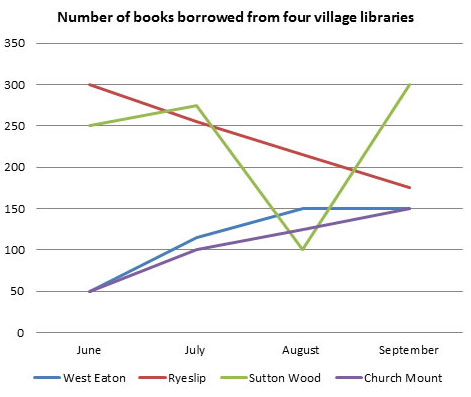
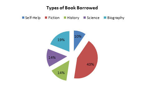
The line graph shows the number of books that were borrowed in four different months in 2014 from four village libraries, and the pie chart shows the percentage of books, by type, that were borrowed over this time.
Summarize the information by selecting and reporting the main features and make comparisons where relevant.
Write at least 150 words.
Model Answer
The line graph depicts the number of books that were loaned out from four libraries over a four month period and the pie chart illustrates the proportions of books borrowed in terms of genre. It is immediately apparent that the borrowing patterns for each library were quite varied, and that fiction was by far the most popular type of book.
The borrowing of books at Sutton Wood and Ryeslip began fairly high, at 250 and 300 per month in June respectively. However, while book borrowing at Ryeslip fell steadily to around 175 at the end of the period, borrowing at Sutton Wood followed a much more erratic pattern. It plummeted to 100 in August, before then rising steeply to finish at 300, which represented the highest level of borrowing of the four.
Borrowing at West Eaton and Church Mount, meanwhile, followed very similar patterns, with both starting quite low at 50 per month, but then gradually increasing to finish at 150.
Moving on to the types of books borrowed, fiction was in demand the most, at 43%. The next most popular books were biographies, accounting for around a fifth of the total. The borrowing of science and history were identical, at 14% each, leaving self-help as the least popular at 10%.
(211 Words)
Comments
Task Achievement
The graph covers all the requirements of the task, which are to describe both of the diagrams, highlight the main features and make comparisons.
There is not any irrelevant information and the data is referred to in order to support the description.
Coherence and Cohesion
The ideas are arranged in a logical way so the graph description is easy to read and follow. Paragraphing is used well as there is an introduction and then separate pargraphs with the various patterns.
Lexical Resource
There is a sufficient range of vocabulary used with precision and flexiblity.
Grammatical Range and Accuracy
There are wide range of sentence structures used, demonstrating that the writer can use a mix of simple and complex sentence forms.
Home › Sample Graphs › Borrowing Books Graph
Further Samples:
Model 1
Fast Food Consumption
Line Graph
Model 2
Charity Spending
Pie Chart
Model 3
School Attendance
Table
Model 4
Shopping Mall
Map
Model 5
Brick Manufacturing
Process
Model 6
UK GDP
Bar Chart
Model 7
Team Scores
Bar Chart
Model 8
Electicity Generation
Pie Chart
Model 9
British Emigration
Bar Chart
Model 10
UK Visits
Line & Bar
Model 11
Car Theft
Line Graph
Model 12
Arrests
Pie & Bar
Model 13
Modes of Transport
Bar Chart
Model 14
Living Expenditure
Table
Model 15
Making Chocolate
Process
Model 16
Monthly Expenditure
Bar Chart
Model 17
Tea Manufacture
Process
Model 18
Poverty
Pie & Bar
Model 19
Borrowing Books
Line & Pie
New! Comments
Any questions or comments about this page or about IELTS?Post your comment here.