IELTS Table: Lesson 10
Describing an IELTS table is similar to describing charts or graphs. The same structures of comparison and contrast are used or language of change if the table is over time.
A table is just another way to present information.
It does not require that you learn a new type of language or a new way to organize things.
For example, take a look at this table showing the quality of life in four countries presented in a table:
Country |
GNP per head (1982: US dollars) |
Daily calorie supply per head |
Life expectancy at birth (years) |
Infant mortality (per 1000 live births |
Bangladesh |
140 |
1877 |
40 |
132 |
If we wanted, we could present this same information as a bar chart:
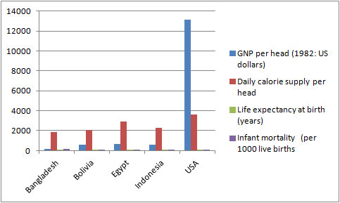
However, as you'll notice, it is better presented as a table because of the huge difference between the USA and the others - this is not very clear on a bar chart.
So a table looks better, but they would both be described in exactly the same way.
Analysing the IELTS Table
As with all graphs and charts, when describing tables:
- Do not describe all the data presented - present the main points of each feature (you should make sure you mention each feature though)
- Look for significant data; e.g. the highest, the lowest etc
- Try and group the data. This may require you to use some general knowledge about the world, such as recognising developed and developing countries
Practice
Look at the IELTS table that you looked at above and answer the questions that follow:
You should spend about 20 minutes on this task.
The following table gives statistics showing the aspects of quality of life in five countries.
Summarize the information by selecting and reporting the main features and make comparisons where relevant.
Write at least 150 words.
Table: The Quality of Life in Four Countries
Country |
GNP per head (1982: US dollars) |
Daily calorie supply per head |
Life expectancy at birth (years) |
Infant mortality (per 1000 live births |
Bangladesh |
140 |
1877 |
40 |
132 |
- What is the table measuring?
- What type of language do you need to use (Change? Comparing and contrasing?)
- What tense would you use?
- Which country has the best quality of life and which has the worst?
- What information could you use for an overview / conclusion?
- How could you group the information?
- How many paragraphs would you have and what you would write about in each one?
Making a Plan
You should always ask yourself these kind of questions before you write your task one. You can then use the answer to these questions to make yourself a quick plan.
Here are some notes made by a student during the planning stage:
PLAN
Topic – standard of living, 5 countries
Language – comparison
Time / tense – 1982 = past
Overview – USA far higher
Groups –
USA = highest
Egypt, Indo, Bol = similar
Bangladesh = very low
Now, take a look at this IELTS table model answer and notice how the organization matches the plan. The groups chosen that are similar are grouped together into paragraphs.
The language is focused on the language of comparison and contrast as the table is not over time. The compare and contrast structures have been highlighted so you can see how they are used.
Is it similar to the way you would have organized the information?
Model Answer
Country |
GNP per head (1982: US dollars) |
Daily calorie supply per head |
Life expectancy at birth (years) |
Infant mortality (per 1000 live births |
Bangladesh |
140 |
1877 |
40 |
132 |
The table uses four economic indicators to show the standard of living in five selected countries in 1982. Overall, it can be seen that the quality of life in the USA was far higher than the other four countries.
To begin, the USA, which is a developed country, had the highest GNP at 13,160 dollars per head. It also had a much higher daily calorie intake and life expectancy, and the lowest rate of infant mortality.
The other developing countries had quality of life ratings that were significantly lower. The range of indicators for Egypt, Indonesia and Bolivia were similar, with Egypt having the highest quality of life amongst the three. However, the infant mortality rate in Egypt’s was slightly higher than Indonesia’s at 97 deaths per 1000 compared to 78 in Indonesia.
Bangladesh had by far the lowest quality of life in all the indicators. Its GNP was one hundred times smaller than the USA’s. Its calorie intake and life expectancy were about half those of the USA, and its infant mortality rate was 10 times greater.
Words 178
Home › IELTS Lessons › IELTS Table
Writing Task 1 (Academic)
Lesson 1:
Describing a Graph Over Time
Lesson 2:
Describing an IELTS Pie Chart
Lesson 3:
Describing an IELTS Process
Lesson 4:
Describing two graphs together
Lesson 5:
Common Language of Change
Lesson 6:
Gap Fill - Bar Chart
Lesson 7:
Gap Fill - Line Graph
Lesson 8:
Common Language to Compare and Contrast
Lesson 9:
A Common Mistake
Lesson 10:
Describing Tables
Lesson 11:
Organizing your answer
Lesson 12:
Gap Fill - Table
Lesson 13:
Using Prepositions
Lesson 14:
Describing the future
Lesson 15:
Gap Fill - Pie Chart
Writing Task 1 (GT)
Lesson 1:
Opening and Closing a Letter
New! Comments
Any questions or comments about this page or about IELTS?Post your comment here.