Task 1: Line Graph - Unemployment in US and Japan
by mehreen

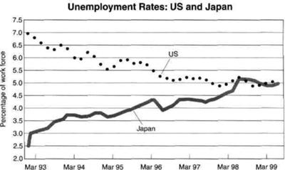
THE GRAPH SHOWS THE UNEMPLOYMENT RATES IN THE US AND JAPAN BETWEEN MARCH 1993 AND MARCH 1999.
The line graph compares figures for unemployment in America ad Japan over a period of six years.
Overall, the unemplyment rate was higher in Japan,compared to the US. However,the proporion of workforce in Japan rose steadily between March 1993 and March 1999, while the figure for America fell.
In March 1993,US had 7% of workfore, in comparison with, only 2.5% in Japan.Between 1993 ad 1997, the American workforce showed a downward trend,whereas the figure for Japanese had un upward trend.
By March 1996,the unemployment rate increased in America as the percentage of workforce fell gradually, reaching 5.5%. By contrast, in Japan, the unemployment rate decreased as the figure for workforce rose steadily,becoming above 4%.
The percentage of workforce in America fell over next three years,reaching 5% in March 1999. There was an overall fall of 2% in the US workforce over this period of six years.
On the other hand,the proportion of Japanese workforce rose over to 5% in march 1998. The figure plateaued between March 1998 and March 1999. There was an overall rise of 2.5% in workforce over a period of six years.
It is interesting to note that both the US and Japan had 5% of workforce by the end of the period shown.
I am note sure whether I ve interpreted this graph correctly.iam
=====================
IELTS buddy
Feedback
Corrected Version:
The line graph compares figures for unemployment in America and Japan over a period of six years.
Overall, at the beginning of the period, the unempl
In March 1993, US had 7%
By March 1996 (don’t do this, it will be confusing – you got to 1997 in the paragraph above, but now you have gone back a year. This will make it difficult to follow), the unemployment rate
The percentage of
On the other hand, the proportion of Japanese workforce not working rose
It is interesting to note that both the US and Japan had 5%
===================
Further comments:
You have to always look carefully to make sure you have identified the correct topic of the graph. You refer to the workforce, but you should be referring to
unemployment as this is what is being shown with the percentages.
I think you may have got mixed up when you analyzed the graph and misunderstood it. On the left axis it is referring to the 'percentage of the workforce who are not working'.
reaching = this is for something going up
There are a lot of corrections on your graph, but it is not as bad as it looks! You do have some good language in there, a lot of the errors have come from you misunderstanding the graph.
Review the language used for writing about 'change' as you do make some errors with this.
You need to vary your language a bit as some of your structures are a bit repetitive as well.
Comments for Task 1: Line Graph - Unemployment in US and Japan
|
||
|
||
|
||
|
||
|
||
|
||
|
||
|
||
|
||
|
||
|
||
|
||
|
||
|
||
|
||