Task 1 Bar Graph Over Time:
Modes of Transport
by DRAVID
(THAILAND )

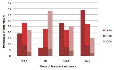
The graph shows the different modes of transport used to travel to and from work in one European city in 1960, 1980 and 2000.
Overall the chart indicates that car used increased over the period shown, where as use of bus declined. The figures for tubes and trains both fluctuated over the same period of time.
As regard, by far the greatest proportion of commuters used bus, at nearly 40%. The figures for other means of transports- tube, car and train- were at around 27%, 22% and 19% respectively.
Between 1960 and 2000, commuters using bus fell in popularity as the figure fell to about 26% in 1980 and this fell even further to 15% in 2000. In contrast, use of car increased significantly to about 23% in 1980, before pushing the figure to well above 35% towards the end of the period. To move to train, the figures increased to about 26%, but this fell to just over 20% by 2000. Use of tube declined in 1980, in terms of tube, there was marked downward trend in 1980, before rising to a quarter in the final year.
==================================================
IELTS buddy
Feedback
Corrected Version:
The bar graph illustrates changes in the transport used to and from work in a particular European city for three years.
Overall the chart indicates that car
Between 1960 and 2000,
==================================================
Overall it is a good answer as you organize your response well, you describe the key features and you make comparisons as well which is important.
You also have some good language in there and use the correct tenses, but as you can see from my corrections, there are still some mistakes you are making with some of your comparison structures and phrasing.
So take note of these and keep practicing. You can view a lesson on writing a graph over time here if you have not already seen it:
Comments for Task 1 Bar Graph Over Time:
|
||
|
||
|
||
|
||
|
||
|
||
|
||
|
||
|
||
|
||
|
||
|
||