Sample IELTS Task 1 Line Graph: Proportion of Elderly People
by Rita Yem (Puma_andev)
(Shanghai, China)

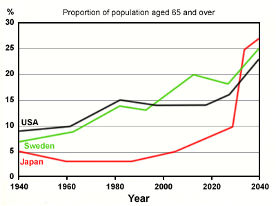
The graph shows the proportion of the population aged 65 and over between 1940 and 2040 in three different countries.
Summarise the information by selecting and reporting the main feature and make comparisons where relevant.
You should write at least 150 words.
The graph outlines the comparison in the amount of ageing people in Japan, Sweden, and the USA. In general, it reveals that the percentage of elderly people is anticipated to soar to almost 25% by the year 2040.
In 1940 the figures of all three countries were negligible as compared with their results in 2040, only 5% in Japan, just about 7% in Sweden, and 9% in the US. As we can observe the proportion of ageing population slightly enhanced in Sweden and the US, making up 15% by the year 1980. By comparison, Japan’s figures somewhat deteriorated, maintaining 3% from 1960 to 1985 before rising again to 5% in 2000’s.
The graph suggests that amount of older people will almost certainly increase in next three decades in the three countries. The most drastic progress is expected in Japan between 2030 and 2040, by which time all three countries will reach similar highs.
==================================================
IELTS buddy
Feedback
Corrected Version:
The graph outlines the comparison in compares the amount percentage of ageing elderly people in Japan, Sweden, and the USA. In general, it reveals that the percentage of elderly people is anticipated to soar to almost 25% by the year 2040 to much higher levels than at present.
In 1940 the figures of all three countries were negligible as compared with their results in 2040, at only 5% in Japan, just about approximately 7% in Sweden, and 9% in the US. As we can observe the proportion of ageing population slightly enhanced increased in Sweden and the US, making up 15% by the year 1980. By comparison, Japan’s figures declined somewhat deteriorated, maintaining 3% from 1960 to 1985 before rising again to
5% in 2000’s.
The graph suggests that the amount proportion of older people will almost certainly increase in the next three decades in the three countries. The most drastic progress change is expected in Japan between 2030 and 2040, by which time all three countries will reach similar highs.
FURTHER COMMENTS
Overall, it's a good answers, with some good language and good organization. Here is some more specific feedback.
Grouping the Data
It is a good answer as you group the information well - dividing it up into a timeframe of the past and then the future. This makes it easy to follow.
Grammar
Some good use of grammar as you get the tenses correct - past for the first part of the graph and future for the second part.
Overview
It is better not to refer to specific data when you say what is happening generally in the graph, otherwise it will look like, or could be mistaken for, more specific detail.
This is why I changed your second sentence in the introduction.
Vocabulary
Amount = for uncountable nouns e.g. oil, water
Ageing people = you can say 'ageing population', but not 'ageing people'. We say 'elderly'.
Enhanced = This means 'to improve' something in terms of beauty or effectiveness. You can't use it to talk about graphs. It does not mean 'increase'.
Deteriorated = This has a particular connotation which is negative i.e. to get worse. But who is to say it is not postive if the number go down? You need to keep your answer factual in this respect.
Progress = Again, this has positive connotations of improvement and can't be used to explain movements of a graph. In any case, it is debatable if a massive increase in the elderly population is 'positive'.
You have some good vocabulary though:
- reveals
- anticipated
- negligible
- maintaining
